
Playwright Mobile Emulation and Responsive Testing Guide (2026)
A website that works perfectly on a laptop can become difficult to use on a phone. Navigation links may disappear, buttons may become hard to tap, and important forms may extend beyond the screen.
These problems affect real users, so they should be caught before the website is released.
Playwright mobile emulation allows testers to simulate selected mobile browser settings, including viewport dimensions, touch support, user-agent information, and device pixel ratio. It helps automate mobile website checks without requiring a physical phone for every test.
Table of Contents
ToggleResponsive testing goes further by checking whether the website remains usable as screen dimensions change.
In this guide, you will learn how to configure mobile devices in Playwright, test iPhone and Android web layouts, detect responsive problems, validate touch interactions, and decide when physical devices are necessary.
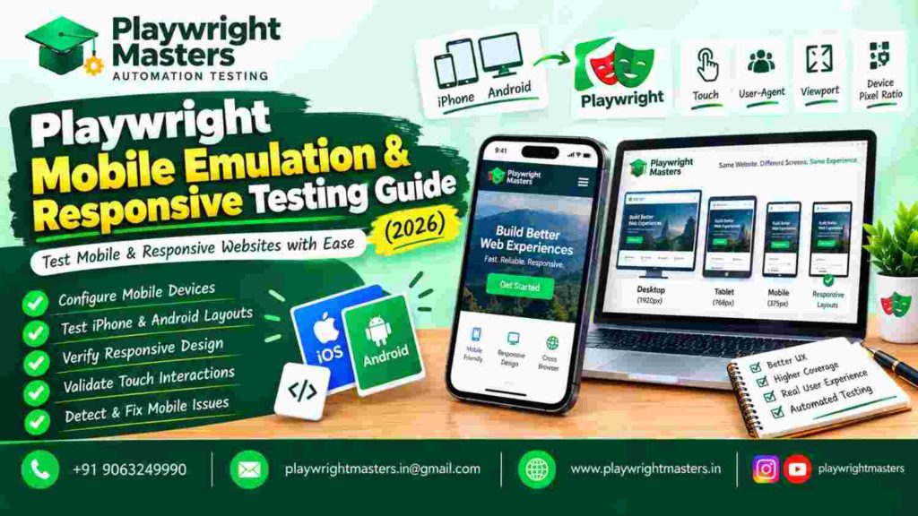
What Is Playwright Mobile Emulation?
Playwright mobile emulation is a browser-testing technique that reproduces selected characteristics of a mobile browsing environment.
These settings may include the visible screen area, pixel density, user agent, mobile viewport behavior, and touch capabilities.
For example, a tester can configure Playwright to simulate an iPhone browser environment and check whether a website displays its mobile navigation correctly.
The test runs in an automated browser configured with the selected device settings.
Mobile emulation does not turn a desktop computer into a physical phone. It reproduces browser conditions that are useful for automated web testing.
What can Playwright mobile emulation test?
Playwright can help verify mobile menus, responsive layouts, touch-operated buttons, form accessibility, and elements that appear differently at particular screen widths.
It can also help test browser behaviors affected by settings such as locale, color scheme, and geolocation.
However, device-specific hardware behavior and native mobile applications require different testing approaches.
For broader automation architecture and browser concepts, explore the Playwright Framework Guide.
What Is Responsive Testing in Playwright?
Responsive testing verifies that a website’s content and controls adapt correctly when the browser’s available screen area changes.
A responsive website may display a full navigation menu on a desktop but replace it with a compact menu button on a smartphone.
A Playwright test can check whether the correct controls appear at each screen size.
Mobile emulation vs responsive testing
Mobile emulation | Responsive testing |
Configures mobile browser characteristics | Checks layout changes at different sizes |
Can simulate touch capability | Checks whether controls remain accessible |
Can use mobile user-agent settings | Evaluates content visibility and positioning |
Uses device profiles or custom contexts | Uses viewports and responsive breakpoints |
Helps reproduce mobile browser conditions | Helps detect layout and usability defects |
The techniques work together.
Emulation establishes the browser environment. Responsive assertions confirm that the application behaves correctly within that environment.
How Does Playwright Simulate Mobile Devices?
Playwright provides predefined device descriptors containing supported browser configuration settings.
A descriptor can include viewport dimensions, device scale factor, user agent, and touch behavior.
Instead of manually setting every property, testers can reuse these descriptors in their Playwright configuration.
Example: Configure mobile testing projects
import { defineConfig, devices } from ‘@playwright/test’;
export default defineConfig({
projects: [
{
name: ‘android-mobile’,
use: {
…devices[‘Pixel 7’],
browserName: ‘chromium’
}
},
{
name: ‘iphone-mobile’,
use: {
…devices[‘iPhone 13’],
browserName: ‘webkit’
}
}
]
});
This creates two browser projects with different mobile configurations.
The first uses Chromium with the selected Android-style settings. The second uses WebKit with the selected iPhone settings.
Run the configured tests using:
npx playwright test
Check that the selected descriptors are supported by your installed Playwright version.
Why does the browser engine matter?
A device descriptor and a browser engine are separate parts of the test configuration.
For example, applying an iPhone descriptor to Chromium does not make Chromium become iOS Safari.
If you need Safari-engine coverage, configure WebKit appropriately.
Even WebKit running with iPhone settings is not identical to Safari running on a physical iPhone.
How to Test an iPhone Website Layout Using Playwright
An iPhone layout test checks whether a website presents usable controls under a simulated mobile browser configuration.
Consider a shopping website that displays a menu button instead of desktop navigation links.
Example: Verify mobile navigation
import { test, expect, devices } from ‘@playwright/test’;
test.use({
…devices[‘iPhone 13’]
});
test(‘mobile menu opens’, async ({ page }) => {
await page.goto(‘https://app.example.com’);
const menuButton = page.getByRole(‘button’, {
name: ‘Open menu’
});
await expect(menuButton).toBeVisible();
await menuButton.click();
await expect(
page.getByRole(‘navigation’, {
name: ‘Mobile’
})
).toBeVisible();
});
This example assumes the application provides those accessible names.
The test checks whether the user can see the menu button and open the mobile navigation.
What makes this better than checking visibility alone?
A visible button is not necessarily useful.
The button might do nothing, open the wrong panel, or display navigation that cannot be operated.
A meaningful mobile test verifies the complete action and expected result.
Use your application’s real accessible labels and navigation structure when implementing the test.
How to Test Android Mobile Layouts in Playwright
Playwright can also simulate supported Android-style browser conditions.
For example, a Pixel device descriptor can help test mobile page layouts under a Chromium-based environment.
Example: Test a product page
import { test, expect, devices } from ‘@playwright/test’;
test.use({
…devices[‘Pixel 7’]
});
test(‘product action is available’, async ({ page }) => {
await page.goto(‘https://app.example.com/product’);
const addButton = page.getByRole(‘button’, {
name: ‘Add to cart’
});
await expect(addButton).toBeVisible();
await addButton.click();
await expect(
page.getByText(‘Added to cart’)
).toBeVisible();
});
The example assumes the website uses the specified button and confirmation text.
A stronger product-page test may also check whether the image, price, quantity selector, and cart controls remain usable.
Can Playwright test native Android apps?
Playwright mobile emulation is primarily intended for browser-based web testing.
It does not replace dedicated native mobile automation tools.
If your project needs to interact with native Android application screens, system permissions, or device-specific features, evaluate appropriate native mobile testing infrastructure.
How to Set Custom Mobile Viewport Sizes
A viewport is the browser’s visible page area, measured in CSS pixels.
Playwright allows testers to set custom viewport dimensions when predefined device settings are unnecessary.
Example: Change viewport size
import { test, expect } from ‘@playwright/test’;
test(‘layout at narrow width’, async ({ page }) => {
await page.setViewportSize({
width: 375,
height: 812
});
await page.goto(‘https://app.example.com’);
await expect(
page.getByRole(‘main’)
).toBeVisible();
});
This checks that the main page region appears at a chosen viewport size.
Is changing the viewport the same as mobile emulation?
No.
Changing the viewport adjusts the visible page dimensions.
It does not automatically configure every mobile characteristic, such as user agent, touch support, or mobile viewport handling.
Use a device descriptor when those characteristics matter to the behavior being tested.
Use custom viewport sizes when the primary objective is responsive layout validation.
How to Test Responsive Breakpoints with Playwright
A responsive breakpoint is a screen width at which a website changes its layout or styling.
For example, a navigation bar may switch to a mobile menu at a breakpoint defined in the application’s CSS.
Testing only one narrow screen may miss problems that occur exactly where the layout changes.
How should you choose breakpoint test sizes?
Start with the application’s actual CSS breakpoints.
If the design changes at 768 CSS pixels, useful test widths may include 767, 768, and 769 pixels.
These widths check the behavior on either side of the breakpoint and at the boundary.
Example: Test several widths
import { test, expect } from ‘@playwright/test’;
const widths = [767, 768, 769];
for (const width of widths) {
test(`layout at ${width}px`, async ({ page }) => {
await page.setViewportSize({
width,
height: 900
});
await page.goto(‘https://app.example.com’);
await expect(
page.getByRole(‘main’)
).toBeVisible();
});
}
This example is a starting point.
To detect actual layout defects, add assertions that describe the expected navigation or content behavior at each width.
What should breakpoint tests verify?
Check whether important elements appear in the correct layout, whether navigation changes as expected, and whether content remains accessible.
Avoid relying solely on the presence of a page’s main element.
A page can contain all its expected HTML while still displaying an unusable layout.
How to Detect Horizontal Overflow on Mobile Screens
Horizontal overflow occurs when content extends beyond the visible webpage width.
It may force users to scroll sideways to read text, complete a form, or reach important buttons.
A common cause is an element with a fixed width that does not adapt to smaller screens.
Example: Detect document overflow
test(‘no unexpected horizontal overflow’, async ({ page }) => {
await page.setViewportSize({
width: 390,
height: 844
});
await page.goto(‘https://app.example.com’);
const hasOverflow = await page.evaluate(() => {
const root = document.documentElement;
return root.scrollWidth > root.clientWidth;
});
expect(hasOverflow).toBe(false);
});
This checks for document-level horizontal overflow.
Does all horizontal scrolling indicate a problem?
No.
Some interfaces intentionally allow horizontal scrolling, including product carousels, code examples, and wide data tables.
A useful test should distinguish intended scrolling inside an element from unintended overflow across the entire page.
If a page uses intentional horizontal content, document-level checks may need more specific assertions.
How to Test Touch Interactions in Playwright
Mobile users often operate websites by touching the screen rather than using a mouse pointer.
Playwright supports tap actions when the browser context has touch capabilities enabled.
Example: Tap a mobile menu button
await page.getByRole(‘button’, {
name: ‘Open menu’
}).tap();
The test requires a touch-enabled browser context.
A suitable mobile device descriptor normally includes the relevant settings.
What should touch tests verify?
A touch test should check that the intended action completes successfully.
For example, tapping a menu icon should reveal the navigation panel.
Tapping a product option should update the selected product.
Submitting a form should produce the expected confirmation or validation result.
Can Playwright simulate every mobile gesture?
No.
Playwright supports touch-related automation, but its standard touchscreen API is limited and does not reproduce every physical gesture or hardware characteristic.
Complex gestures, system-level behaviors, and device-specific interactions may require additional methods or real-device testing.
How to Test Mobile Navigation and Menus
Mobile navigation is a frequent source of usability problems.
A website may hide desktop links behind a menu button, accordion, or slide-out panel.
Automated tests should check both opening and using the navigation.
Example mobile-navigation test
test(‘mobile navigation works’, async ({ page }) => {
await page.goto(‘https://app.example.com’);
await page.getByRole(‘button’, {
name: ‘Open menu’
}).click();
const navigation = page.getByRole(‘navigation’, {
name: ‘Mobile’
});
await expect(navigation).toBeVisible();
await navigation.getByRole(‘link’, {
name: ‘Contact’
}).click();
await expect(page).toHaveURL(/contact/);
});
The example assumes a navigation region named Mobile and a Contact link.
What navigation problems should you detect?
Check whether the menu opens, links remain visible, users can select destinations, and the overlay does not block essential controls unexpectedly.
Also test closing the menu when that behavior is part of the application.
For sites with sticky headers, verify that menu content remains accessible when the page is scrolled.
How to Test Portrait and Landscape Layouts
People use phones in both portrait and landscape orientations.
A layout that works at a narrow portrait width may behave differently when the available width increases and the height decreases.
Playwright can simulate different viewport dimensions.
Example portrait viewport
await page.setViewportSize({
width: 390,
height: 844
});
Example landscape-sized viewport
await page.setViewportSize({
width: 844,
height: 390
});
After changing the dimensions, check whether navigation, primary content, and important controls remain usable.
Does resizing reproduce physical phone rotation?
Not completely.
Viewport resizing changes the browser’s dimensions, but it does not necessarily reproduce every hardware orientation event or operating-system behavior.
Use physical devices when those details are essential to the application.
How to Test Responsive Mobile Forms
Mobile forms should remain readable and usable on small screens.
Important inputs must be visible, labels should describe their purpose, and validation messages should not make the form impossible to complete.
Example: Mobile form submission
test(‘contact form works on mobile’, async ({ page }) => {
await page.setViewportSize({
width: 375,
height: 812
});
await page.goto(‘https://app.example.com/contact’);
await page.getByLabel(‘Email’).fill(
‘tester@example.com’
);
await page.getByLabel(‘Message’).fill(
‘Mobile form test’
);
await page.getByRole(‘button’, {
name: ‘Send message’
}).click();
await expect(
page.getByText(‘Message received’)
).toBeVisible();
});
This example assumes that the application accepts the sample data and displays the stated confirmation.
What else should mobile form tests check?
Verify whether validation messages appear beside the relevant fields, required inputs remain reachable, and the submit button is not hidden behind sticky elements.
Check that error messages do not overlap other text.
Mobile emulation cannot fully reproduce every physical keyboard, autofill experience, or operating-system interaction.
Use selected real-device tests for important form workflows.
How to Test Whether Buttons Are Usable on Small Screens
A button may technically be visible while being difficult for a person to use.
For example, a fixed footer may cover its lower portion, or another element may overlap it.
Playwright can inspect whether a control is visible and enabled.
const submitButton = page.getByRole(‘button’, {
name: ‘Continue’
});
await expect(submitButton).toBeVisible();
await expect(submitButton).toBeEnabled();
await submitButton.click();
Playwright performs actionability checks before supported actions such as clicking.
However, a successful automated click does not prove that a button is comfortably sized for a person’s finger.
For accessibility and usability, evaluate target dimensions and spacing against your project’s design requirements.
How to Test Mobile Screenshots Without Relying Only on Appearance
Screenshots are useful for detecting layout changes.
Playwright supports screenshot assertions that compare the current rendering with an approved baseline.
Example: Mobile screenshot comparison
import { test, expect } from ‘@playwright/test’;
test(‘mobile layout matches baseline’, async ({ page }) => {
await page.goto(‘https://app.example.com’);
await expect(page).toHaveScreenshot(
‘mobile-homepage.png’
);
});
Run this test under a configured mobile project so the viewport and browser settings are consistent.
Screenshot tests are sensitive to rendering differences, fonts, animations, and environment changes.
Are screenshots enough for responsive testing?
No.
A screenshot may show a menu button but cannot prove that clicking it works.
Combine visual comparisons with functional assertions that verify navigation, forms, and other user actions.
For a general overview of automated testing techniques, see the Playwright Automation Testing Tutorial.
How to Test Mobile-Specific Browser Settings
Some applications adapt their behavior according to browser settings as well as screen dimensions.
Playwright supports emulation of settings such as user agent, locale, timezone, geolocation, and color scheme.
These features are useful when the website provides localized content or different display modes.
Example: Test dark mode
test.use({
colorScheme: ‘dark’
});
test(‘dark mode page loads’, async ({ page }) => {
await page.goto(‘https://app.example.com’);
await expect(
page.getByRole(‘main’)
).toBeVisible();
});
This confirms that the page’s main region appears with dark-mode preference enabled.
It does not prove the theme looks correct.
To verify dark styling, inspect relevant computed styles or use a controlled visual comparison.
To verify dark styling, inspect relevant computed styles or use a controlled visual comparison.
Why should you test browser preferences?
A website may behave correctly in default settings but fail when a different preference is applied.
For example, dark text may become unreadable on a dark background.
Choose preference-based tests based on the features your application actually supports.
How to Choose the Right Mobile Testing Coverage
Running every test across every possible device is rarely necessary.
A more useful strategy is to select environments that represent important user conditions and known application risks.
Recommended test coverage matrix
Test category | Example environment | What to verify |
Narrow mobile | Small phone viewport | Navigation and readable content |
Typical Android | Chromium with Android-style descriptor | Main customer workflows |
iPhone-style browser | WebKit with iPhone descriptor | Mobile web behavior |
Tablet | Tablet-sized viewport | Layout changes and form usability |
Breakpoint boundaries | Widths around CSS breakpoints | Correct layout switching |
Landscape | Wide, short viewport | Content and navigation reachability |
Desktop | Standard desktop configuration | No regressions to larger screens |
These are example categories, not mandatory device models or a universal test standard.
The right matrix depends on actual site usage, supported browsers, and the consequences of failures.
How many device profiles should a team maintain?
Start with a small, representative group.
Add configurations when analytics, customer reports, or known compatibility issues justify them.
Too many nearly identical device projects can increase execution time without providing meaningful additional coverage.
Playwright Mobile Emulation vs Real Device Testing
Playwright emulation offers repeatable automated tests under controlled browser settings.
Real-device testing checks how the application behaves on physical hardware with its operating system, browser, input methods, and network conditions.
These approaches serve different purposes.
What can emulation miss?
Emulation may not reproduce the full behavior of physical mobile keyboards, browser interface controls, device performance, operating-system permissions, and hardware-specific features.
It also cannot guarantee identical rendering on every actual phone.
When should you use real devices?
Use real-device testing for workflows where physical behavior matters or where a defect would seriously affect users.
Examples include critical mobile purchases, complex touch interactions, device-specific rendering problems, and workflows influenced by mobile operating-system features.
A practical strategy combines broad automated emulation with targeted checks on actual devices.
Common Playwright Mobile Emulation Errors and Solutions
Mobile tests can fail because browser configuration and application expectations do not match.
Problem | Likely cause | Recommended fix |
Mobile menu not visible | Incorrect viewport or device configuration | Confirm the active project |
Tap action fails | Touch capability not enabled | Use a touch-enabled context |
Layout differs from expected device | Browser engine or descriptor mismatch | Review both settings |
Test fails near breakpoint | Responsive CSS boundary issue | Test both sides of breakpoint |
Unexpected horizontal scrolling | Fixed-width element or overflow | Inspect the affected container |
Screenshot difference | Font, animation, or rendering variability | Stabilize the test environment |
Mobile test passes but real phone fails | Emulation limitation | Reproduce on a physical device |
Why does a mobile test pass on one project but fail on another?
Different projects may use different browser engines, viewport sizes, user agents, or touch settings.
These differences can expose genuine browser compatibility issues.
Compare the project configuration first. Then inspect the application’s actual behavior before changing assertions.
Avoid weakening a test simply to make every project pass.
How to Run Playwright Mobile Tests in CI/CD
Mobile emulation tests can run automatically in CI pipelines.
This helps teams detect responsive regressions before deploying website changes.
Run a specific mobile project
npx playwright test –project=android-mobile
The project name must match the name defined in your Playwright configuration.
Run all configured projects
npx playwright test
What should CI reports include?
Capture failed assertions, relevant screenshots, and traces when needed.
These artifacts can help determine whether a failure involves a locator, application behavior, or browser configuration.
Keep the execution environment consistent so that comparisons remain meaningful.
How do you avoid unnecessary mobile test execution?
Separate critical mobile workflows from broad browser-compatibility checks when appropriate.
Run essential checks on every significant change and schedule wider coverage according to project requirements.
Do not assume every test needs to run on every device profile.
Playwright Mobile Testing Checklist
Before releasing a responsive website, review these practical checks:
- Mobile device projects use the intended browser engines.
- Primary navigation works on narrow screens.
- Important content remains readable.
- Buttons and links remain accessible.
- Forms can be completed successfully.
- Validation messages are visible and understandable.
- No unexpected page-level horizontal overflow occurs.
- Responsive breakpoints behave correctly.
- Portrait and landscape-sized layouts are reviewed.
- Touch interactions work in supported contexts.
- Visual checks have stable baselines.
- Critical workflows are reviewed on physical devices where necessary.
This checklist should be adapted to the application’s actual requirements.
Frequently Asked Questions About Playwright Mobile Emulation
1. What is Playwright mobile emulation?
Playwright mobile emulation simulates supported mobile browser characteristics, including viewport size, user agent, pixel density, and touch capability. It helps developers automate mobile website testing without using physical devices for every test.
2. How do I enable mobile emulation in Playwright?
Import a supported device descriptor from @playwright/test and apply it to a project or test configuration. For example, devices[‘Pixel 7’] provides predefined settings for a Pixel-style browser environment.
3. Can Playwright test responsive websites?
Yes. Playwright can test responsive websites using custom viewport dimensions, device descriptors, and assertions that verify navigation, content visibility, form behavior, and layout changes.
4. How do I test an iPhone layout using Playwright?
Configure a supported iPhone device descriptor, preferably with WebKit for Safari-engine testing, then run assertions against the mobile page. This simulates selected iPhone browser conditions rather than testing a physical iPhone.
5. Can Playwright emulate Android phones?
Yes. Playwright provides device descriptors suitable for Android-style browser testing with Chromium. The tests run in an emulated browser environment, not necessarily on Android hardware.
6. What is the difference between viewport testing and device emulation?
Viewport testing changes the visible page dimensions. Device emulation can additionally configure mobile-related properties such as touch capability, user agent, device scale factor, and mobile viewport behavior.
7. How do I test touch events in Playwright?
Use a browser context with touch support enabled and perform appropriate tap actions. A suitable predefined mobile device descriptor generally includes touch settings.
8. Can Playwright detect horizontal overflow?
Yes. Playwright can inspect document dimensions to detect content extending beyond the visible page width. Tests should allow intentional scrolling within elements such as carousels or wide tables.
9. Can Playwright test mobile landscape mode?
Playwright can test landscape-sized viewports by adjusting width and height. This helps reveal layout issues, but viewport resizing does not reproduce every physical orientation behavior.
10. Is mobile emulation identical to testing on real devices?
No. Mobile emulation reproduces selected browser characteristics but cannot fully reproduce physical hardware, operating-system behavior, performance, or every mobile-browser difference.
11. Can Playwright test native mobile applications?
Playwright is primarily designed for browser-based automation. Its mobile emulation does not replace a dedicated native mobile application testing framework.
12. How should teams select mobile devices for testing?
Choose representative configurations based on application analytics, supported browsers, screen-size breakpoints, and risk. Use physical devices for critical workflows that depend on real hardware or operating-system behavior.
Conclusion: Build Mobile Tests Around Real User Tasks
Playwright mobile emulation helps teams test how websites behave under selected smartphone and tablet browser conditions.
Device profiles provide repeatable configurations, while viewport testing helps expose responsive layout problems.
However, a useful mobile test should do more than confirm that a webpage loads.
It should check whether people can navigate, read content, complete forms, and perform important actions without unexpected problems.
Combine representative device projects, breakpoint assertions, touch testing, and targeted physical-device validation for stronger mobile web coverage.

Playwright Masters Team
Playwright Automation Testing Experts | Industry-Focused Training & Practical Learning
Playwright Masters is a dedicated automation testing training platform focused on helping learners build practical skills in Playwright automation testing. Our training covers real-world automation concepts, framework practices, coding, debugging, API testing, cross-browser testing, CI/CD, and interview preparation to help learners develop job-ready testing skills.